The Truth About The Laffer Curve Theory And How It Affects You
We may receive a commission on purchases made from links.
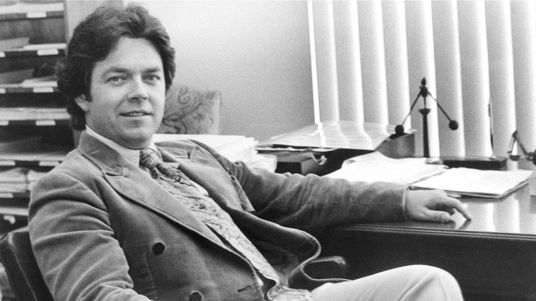
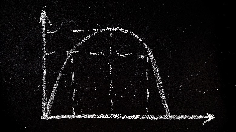
"You can explain it to a congressman in six minutes, and he can talk about it for six months," Hal Varian, an economist, once noted of the tax revenue curve known as the Laffer curve. In concept, the Laffer curve seems fairly intuitive: Tax revenues are directly proportional to tax rates in a parabolic relationship with zero revenue created at both 0% and 100% extremes and an equilibrium figure somewhere in the middle that produces maximum tax revenue. The Laffer curve was conceptualized by Arthur Laffer in 1974, and it has remained a popular argumentative tool in pushing for lowering tax rates for individuals, corporations, and beyond. It's easy to see why this curve feels intuitively accurate, because at either extreme the graph does depict a legitimate reality.
But virtually everything in between the laughably cartoonish notions of a government imposing a 100% tax rate or a nonexistent one in the United States is fraught with trouble. This hasn't stopped politicians from advancing the idea and pointing to the bell-curve visualization as a means to win support for changes to the American tax system. More importantly, the curve showcases a single-minded simplicity in its evaluation of a nation's taxation system. It doesn't take into account any of the granular details that necessarily feature prominently in any tax plan. With these features in mind, it's a great idea to brush up on your understanding of the Laffer curve so that you can explore tax policy ideas in greater detail when your local politicians offer their ideas on the debate stage, the committee floor, or town hall. (Read about the most important tax breaks you should know.)
The Laffer curve relies on a static tax rate
Right off the bat, it's important to point out that this curved graph known as the Laffer curve is a representation of a hypothetical, if simplistically correct, observation. Indeed, there's an equilibrium point in any sliding scale of economic supply and demand. But the Laffer curve falls exceedingly short when it's put to the test against real world conditions.
For one thing, the curve doesn't attempt to define where the equilibrium rate ("e") might exist, only suggesting where the "all" and "none" extremes lie, which is, of course, naturally obvious to any observer. What this creates is essentially a meaningless graph. Without data featuring in the X and Y axes, it's impossible for the imagery to mean anything beyond a fancy squiggle, even if its baseline implication feels important and inherently grounded.
More importantly, though, the Laffer curve applies a static taxation rate as its means of evaluating revenue-generating potential. It would become overly complicated to base the curve's calculation on marginal tax brackets, and that would defeat the tool's purpose. The American tax system features something resembling taxable "buckets," and the IRS provides a table on this. Not considering tax breaks you might be able to deploy (to get a bigger refund), your first $11,000 earned are taxed at 10%, earnings up to $44,725 are taxed at 12%, anything between that and $95,375 gets a 22% tax-rate treatment, and so on. So, a salary of $60,000 (roughly the U.S. average, according to Forbes) would yield a gross tax obligation of around $8,500, rather than a flat 22% tax rate calculating at $13,200.
The curve and Reagan-era tax cut strategies
Arthur Laffer was a member of former President Ronald Reagan administration's Economic Policy Advisory Board and a staffer and consultant for administrations before Reagan in the 1970s. Laffer worked in the Office of Management and Budget, and later served as a consultant for various cabinet secretaries. Much later (in 2018), Laffer would write a book with a Trump administration figure to talk up the economic policies of the term, which remain quite a mixed bag when economists look back on them.
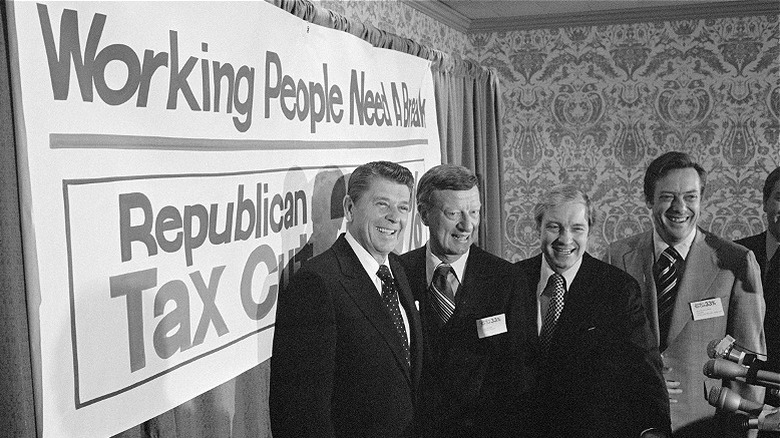
But Laffer's most prominent contribution to American politics is the tax revenue curve named for him. It featured as a primary driver behind the thinking to cut taxes during the 1980s, when the Reagan administration slashed the top tax rate from 70% to 50% in one of the largest tax reductions to ever take place in American economic history. Reagan later increased taxes on programs like Social Security to weather the storm of a vicious recession in the early '80s. By the end of the decade, Reagan had again cut the top tax rates, leaving office with the highwater mark at 33%. Much of the trickle-down economic theory was explored and advocated for in these years through the use of visualization tools like Arthur Laffer's curved model.
The theory's rife with inconsistencies
Without an understanding of where the equilibrium rate ("e") lies in relation to the current tax rate used by the administration, it's impossible to know if raising or lowering taxes will create the desired effect (i.e., an increase in tax revenue). The bell curve's parabolic figure cuts in either direction from e at a seemingly equal pace, meaning e could, and perhaps should, be considered as representing a 50% tax rate.
However, it's worth noting that some economists have estimated the optimal revenue generating figure to be 70%. The problem with both of these figures is obvious: They lie far north of the rate politicians want to push for. So rolling out the Laffer curve as a prop to help make the case for a tax policy change and then suggesting a reduction in the rate is oxymoronic at best and totally duplicitous at worst. Moreover, it's crucial to note again that these comparisons are missing a key component in the fact that marginal tax rates complicate this matter far beyond the curve's simple, static-rate assumption.
Another bug in the system is the reality that an optimal revenue-generating tax rate and a rate that's best for the country as a whole are not the same thing. Generating revenue doesn't mean pouring that money back into services for citizens on a dollar-for-dollar basis. Oftentimes it actually accomplishes the opposite. At its core, the Laffer curve functions as a means to justify tax cuts for those who need them the least. Decades of data from trickle-down tax policies have shown themselves to be nothing more than opportunities for the wealthiest to become more endowed while leaving the rest behind.


