Home Trends That Aren't Worth Your Money
Homeowners and renters with stylistic control over their living spaces may often find themselves tempted to lean into a design trend that's making the rounds. Trendy interior style can feel like a glowing revamp that brings you closer to the zeitgeist and shows off your home in a fashionable way when friends or family come to visit. But hot trends often fail to provide a lasting impact that makes your home look and feel timeless and complete.
Design quirks often come and go at a surprising pace, and many trending features that are all the rage in the present moment are already on the way out. Investing in trendy designs and stylistic changes in your home can bring a nice accent today, but a considerable expense tomorrow. This is especially true for homeowners who may be looking farther ahead and already know that they'll be selling their home and moving on to some greener pasture — perhaps even soon. These design trends, including bold color choices, tile decisions, and open storage inclusions, might fit in perfectly with the dominant stylistic language of the moment. Still, they likely won't age well over the coming months and years, leaving you with a headache and a potentially inflated bill to make changes that return the space to something more livable and desirable.
The farmhouse look
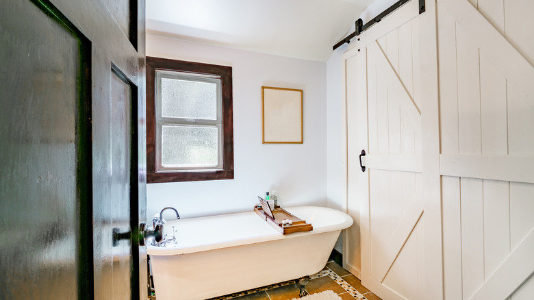
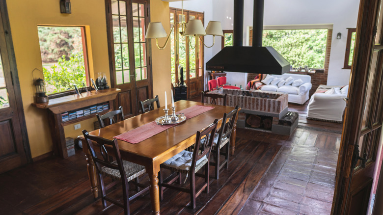
Farmhouse doors, shiplap wall accents, and other rustic design trends have seen far less use in recent years. There was a time when the farmhouse look was a major force in the home decorating space. But that time seems to have largely passed. Homeowners are generally moving away from the use of farmhouse design language in their living spaces, and buyers are seemingly more interested in modern and functional designs rather than this style that leans heavily into a sort of lived-in aesthetic.
Perhaps the issue with the farmhouse look is that it feels jarringly out of place for most homes that aren't actually found in rural areas. Traditionally speaking, agricultural living has been dominated by early mornings, considerable time spent outdoors, and a demand for open spaces and comfortable interiors that offer both ample storage and a laid-back home life. Farmhouse design often incorporates wooden textures with soft edges and an overtly distressed feel. These spaces are inviting because they feel comfortably used and vibrantly alive. But it's easy to go overboard with this style and in environments located in suburban or city communities, the home immediately stands out as something that doesn't belong. The result is a space that may require substantial renovations for anyone who tires of the look or wishes to sell their home.
Rose gold furniture accents and fixtures
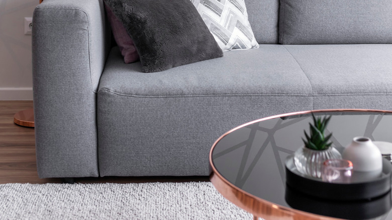
Rose gold is a very specific kind of shade, and it often doesn't play well with others. In jewelry and decorative accents, rose gold can be a beautiful feature that elevates other design choices. But there is a major caveat that comes along with the decision to incorporate rose gold features. The pink hue accents a very select color palette well and stands out as something obnoxious and out of place with most other colors. Designers suggest that rose gold fixtures and other appointments should be paired up with other pinkish shades, primarily (as well as whites and select pastel-type colors).
In contrast, metal fixtures shaded in traditional gold, silver, or even brass offer a more versatile pairing opportunity. Aside from any design considerations, homeowners looking to change up the feel of their property should steer clear of rose gold accents because the next change that you make is likely to require an expanded budget in order to replace those rose gold features. By including this color in one room or throughout your home, you shoehorn yourself into either a reduced opportunity for tonal selection or an elevated expense to replace fixtures alongside new paint or furniture changes.
Open kitchen cabinetry
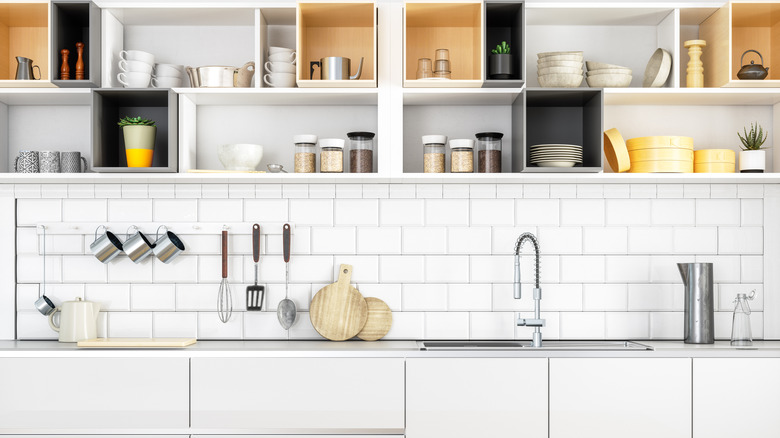
Kitchen cabinets are more than just a design choice. While there are plenty cabinet door options available, one selection that homeowners have increasingly made in recent years is the use of no cabinet doors at all. Instead, some people have opted to leave their kitchen shelving open, improving ease of access to the storage space and substantially and drastically altering the visual presence of things kept in the kitchen.
Unencumbered shelving can add a sense of lightness and an open feel to the space. However, altering your kitchen cabinets and allowing the interior space to stand as an open design choice means that these shelves will need to be kept clutter-free and in good order at all times. Unruly stacks of plates, cups, or other kitchen wares will immediately stand out as disorderly and chaotic. Moreover, many kitchen cabinets found in contemporary homes may not be suitable for a simple conversion that only sees the doors removed. If your cabinets are made with particle board (or chipboard) or some other kind of non-premium material (for instance, if they came as a flat-packed furniture piece) then the edges might not stand up well to exposure, both functionally and visually. This means that making a change to open shelving might require a complete replacement of the cabinetry, an expensive decision that may ultimately prove to be a mistake. Kitchens have a way of busting budgets already, it's worth skipping this trend and adding another cost-inducing feature to the room.
Loud and trendy tile patterns (especially if you can't confidently retile yourself)
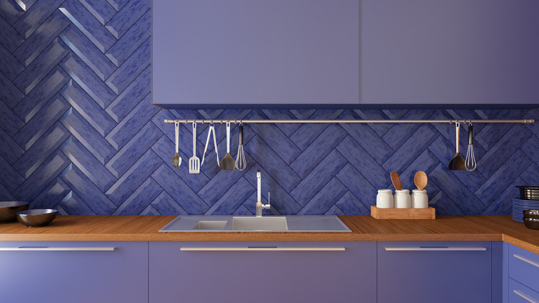
A noisy kitchen backsplash that utilizes trendy colors or bold patterns might be all the rage today. But tile styles change with surprising speed. Homeowners wanting to get the most out of their kitchen remodel will want to opt for a more timeless look with these semi-permanent fixtures of the cooking space. Tile selection, both in terms of flooring and on any walls that you may be augmenting, requires a consideration of the future. Retiling portions of your kitchen is a time-consuming job for those who have the confidence and skill level required to do it themselves. But for homeowners who can't, it's an expensive lesson in planning around constantly shifting design trends and remodeling decisions.
Your best bet when picking out new tile is to think about how that choice will age. If you aren't prepared to make updates to this part of your kitchen again shortly when you pick out a trending style, you should avoid bold patterns and perhaps shy away from influencer-inspired designs altogether. A classic look will stand in your kitchen for the long run and ensure that your home retains excellent resale value and provides visually appealing space for many years to come.
The all-black look
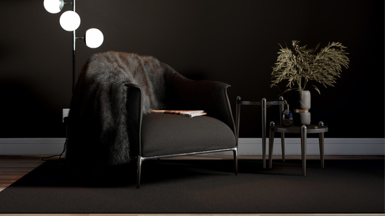
Dark shades are extremely trendy and a room that is shrouded in the color black from top to bottom can set a powerful mood while showcasing a dramatic interior style. The all-black look offers a mesmerizing visual appeal when done well. It's perhaps for this reason that so many people are taken in by pictures they see of this thematic choice. The decision to shade a room in your home in this way is a bold one, and if you can pull it off it can provide a stunning backdrop for hosting events or sharing an afternoon with friends.
But there's a reason why so few people incorporate this look in their homes. The all-black look is immensely difficult to flatteringly deliver. The average homeowner isn't able to match bright natural lighting and other essential features with the domineering tone of intense visual darkness. The result is a suffocating interior space that looks and feels small and uninviting. To make matters worse, the darker you paint your walls the harder it will be to reverse that decision. When repainting with light shades, you may get away with only offering up two coats — potentially painting an entire room in a day or a house in a weekend. This cannot be said for darker colors, and certainly not with black. Repainting a room that has been doused in black paint will require more paint and more time, ratcheting up the financial, physical, and time expenditures of the redecorating effort.
Oak and pine dominated furniture
Wood-forward furnishings have become somewhat outdated. There's always space in just about any home for wooden furniture, and a classy hardwood coffee table, rocking chair, or TV stand can offer a textural elevation of a room that might otherwise be missing something. But wooden furniture can easily come to dominate a room. This is particularly true for furniture crafted with oak and pine, two of the most common building materials for home furnishings. Both wood species provide a light brown color palette that can come to seem fairly bland when paired up with several other wooden features in your living space.
Homeowners, and by extension buyers, have come to see modern design features as a desirable decorative language in the home. This means that moving away from primarily wooden furniture and fixtures can make your space feel more vibrant and inviting. One way to do this is by moving away from couches that include exposed oak or pine accent sections along the armrests or as feet that serve a visual purpose. Similarly, a metal and glass coffee table can act to dramatically break up the antiquated feeling that might otherwise descend over the room. If you're staging your home or even looking to decorate a rental property, a mix of modern design flourishes with some wooden accent pieces used sparingly can help you achieve the desired effect.
Wall-to-wall carpeting
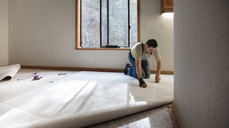
Carpets can be luxurious flooring solution that makes your home look great and feel comfortable. But it's easy to go overboard when installing carpet in your home. Too much carpeting can actually be a hindrance when it comes to elevating the style of your property. Many buyers have become infatuated with hardwoods and laminate flooring and this preference doesn't seem to be slowing down anytime soon. Wall-to-wall carpeting can therefore make a property feel dated and perhaps even somewhat cheap when compared with a home that utilizes a greater selection of flooring options.
Moreover, carpeting can often require a more labor and capital-intensive cleaning routine than alternatives like tile and hardwood floors. A high-quality laminate or other hard flooring installation will remain durable and attractive for many years to come without a homeowner having to invest significant time or money into routine upkeep or overhaul. Carpeting on the other hand demands steam cleaning on a semi-regular schedule and often benefits from replacement at a far more hasty pace. Tile, vinyl, and laminates possess a somewhat timeless look that is easy to maintain while carpets require more effort and wear out much faster. Carpeting can be an added liability for those looking to sell their home, as well. Replacing carpeting is a costly decision that often doesn't add a whole lot of value. But old carpet can reduce your home's potential selling price, offering a tough decision for homeowners.
Too much indoor foliage
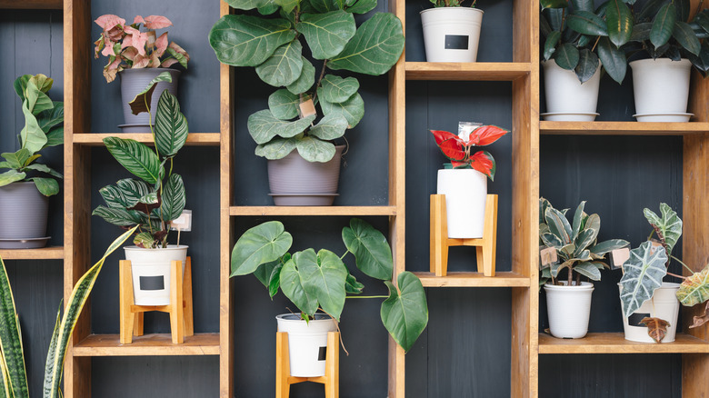
Houseplants make for an excellent addition to the home. A few tasteful inclusions can provide a bit of color inside your living space and even offer up a nice natural look that can even add a bit of freshness to the air. Houseplants are a favored addition to many homes, and the industry was worth $16 billion in 2021, signaling a position of immense strength.
There's a lot to love about houseplants, but it's easy to go overboard and incorporate too much foliage in your interior style. Too many houseplants make for quite a bit of work to keep them alive and looking vibrant — something that people are notoriously bad at achieving. This means watering plants and caring for soil, nutrients, pot, and drainage issues, among other needs. If you've decided to add houseplants to your property, keeping them alive is an essential component for ensuring that your home's aesthetic doesn't become rundown. Dead or dying plants actively negate the look and feel you're trying to achieve. Perhaps more importantly, even if you are successful in managing an indoor garden, too much growth can attract bugs and other pests. Ultimately this can create an infestation situation within your home that may be time-consuming and costly to deal with. A few plants can be a nice touch, but a lot can lead to significant maintenance and financial headaches.
Cheap furniture
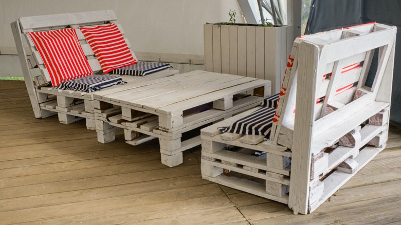
Cheap furniture is something that many homeowners and renters deal with regularly. It's enticing to pick up an inexpensive end table or set of chairs to complete the look of a room in a hurry. Flat-pack furniture is particularly notorious in this decorative role. There is a place for quick and easy furniture installations, but these kinds of additions to your home should be used sparingly rather than as a primary means of rounding out its furnishings. When it comes to furniture, you get what you pay for. Cabinetry, shelving, tables, and even couches and chairs routinely last in rough correlation with the amount of money spent on them. Shelving built with hardwoods is more durable than a similar style amenity that was constructed with chipboard or even MDF. These materials make it easy for anyone to assemble the parts and drastically reduce the cost of a piece of furniture, but this comes with an often significantly diminished lifespan.
If you're looking to invest in furnishings that will last for many years and provide ample value in your home, opting for a more expensive purchase will provide you with better longevity and overall value. With that being said, a quick stopgap solution, a shelving unit that will live in the shed or garage, or even furniture that you expect your children to grow out of rapidly represent a different kind of calculation. In these instances, cheap or flat-packed furniture may indeed be the most appropriate option.
All-white rooms
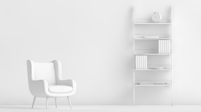
In the same way that an all-black décor can be immensely difficult to pull off, an all-white room offers the same kind of challenges about a similar stylistic aesthetic. Unlike the bold statement made by a room dominated by black shades, an all-white room is a far lighter and airier affair. These rooms are bathed in brightness and can act as a central feature in your home if executed immaculately.
The problem with the all-white landscape is that it requires constant cleaning and virtually endless attention to the most minute details. An all-white room can easily look dimensionless without some kind of contrast to play off the bare visual dynamic of a bleached-out space. This means that all-white rooms require some kind of additional texture or color that interrupts the dominant pattern, but this delicate balance can be immensely hard to achieve. Similarly, rooms featuring the all-white color palette don't shine nearly as well as they should when they aren't immaculately clean. In the same way that an all-black feature requires some sort of brightening element, the all-white look leans heavily on unvarnished surfaces and lines. This means that everything in the room must be spotlessly clean and nothing can be broken or damaged in order to fully realize the effect. The reality is that you'll spend more time maintaining the room than you will enjoying it, making it a costly design choice it just isn't worth the effort.
The plaster wall effect
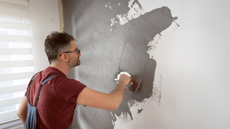
The plaster wall effect is something that people have been utilizing to great effect in recent years. Essentially what this accomplishes is the creation of a sort of rustic style that imitates old-world charm. Both vintage and modern European construction rely on blockwork and a plaster coat to establish rock-solid walls and solid interior dimensions. Modern builds aim to create clean lines and unblemished surfaces, but this style of construction still creates semi-rounded edges in many circumstances. Vintage plaster is a different look altogether and often incorporates wavy lines and imperfect surfaces that aren't always completely square.
Modern design has adopted this imperfection as a feature in contemporary plaster wall aesthetics rather than an unintended side effect. These kinds of feature walls often look fantastic when paired with other subtle rustic accents and fixtures. They may work well in exterior living spaces that aim to highlight themes of nature and relaxation, too. Think Vintage Italian hamlet and you're on the right track/ But not everyone likes this style and if you're considering selling your home in the near or intermediate future, integrating this kind of design feature can actually be a hindrance to your efforts at improving resale value. Removing this design feature can be a hassle and add to the overall expense of your real estate efforts.

